
Form Rows
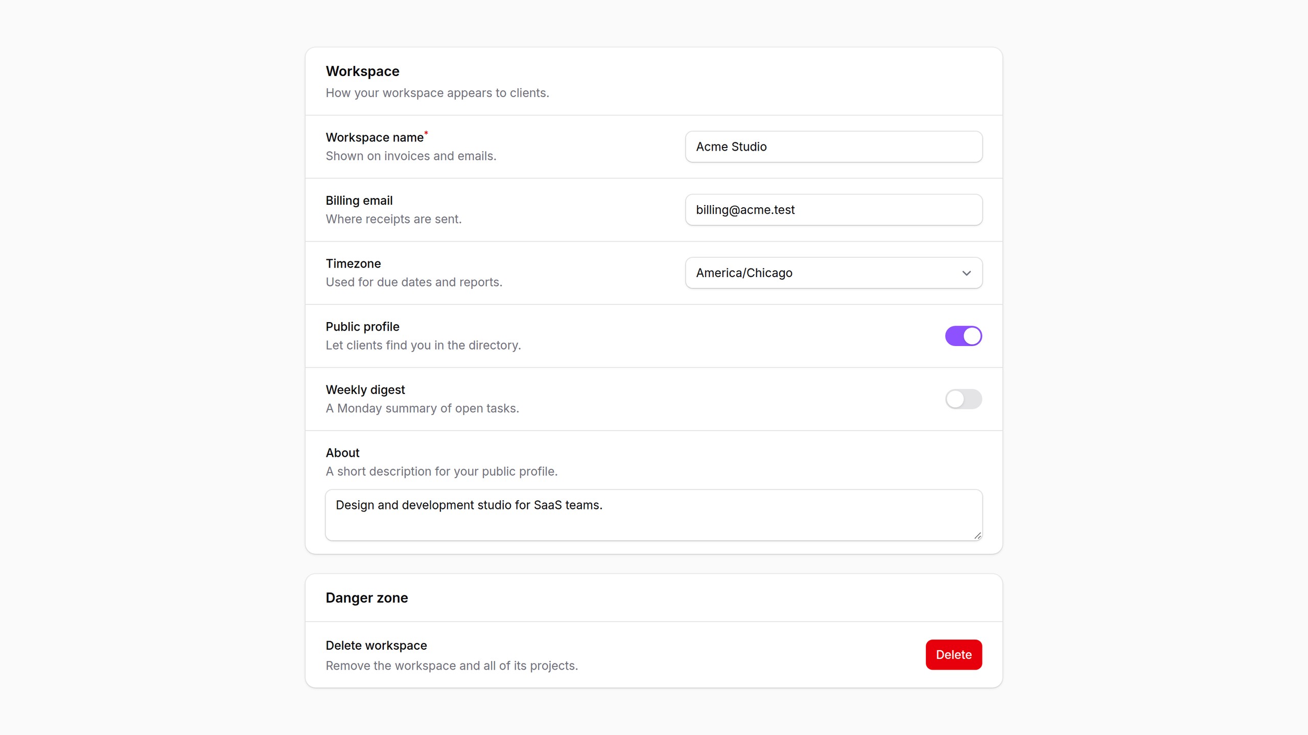
Settings-style form rows for Filament: label and help text on the left, the control on the right, divided by hairlines. Taken from the Citrus theme.
What it does
Settings-style form rows for Filament. Each field gets its own full-width row, with the label and help text on the left and the control on the right, and the rows are divided by hairlines.
The layout is built on Filament's own field wrapper hook, so it works with every field, including custom ones, without overriding any Filament views. It uses Filament's color variables, so it fits stock Filament and any theme.
The rows come from Citrus, FilaFly's premium Filament theme. Citrus adds its own framed field styles on top; Form Rows is the layout on its own, for any panel.
Requirements
- PHP 8.2+
- Filament v4 or v5 (tested with 4.16 on Laravel 12 and 5.11 on Laravel 13)
Installation
You can install the package via Composer:
composer require filafly/filament-form-rows
Publish the assets:
php artisan filament:assets
There is no plugin to register. The stylesheet loads anywhere Filament's styles do, in panels and in standalone Livewire forms alike.
Usage
Rows is a drop-in replacement for Section:
use Filafly\FormRows\Components\Rows;
use Filament\Forms\Components\Textarea;
use Filament\Forms\Components\TextInput;
use Filament\Forms\Components\Toggle;

Rows::make('Profile')
    ->description('How you appear to customers.')
    ->schema([
        TextInput::make('name')
            ->helperText('Shown on invoices and emails.'),
        Toggle::make('is_public')
            ->label('Public profile'),
        Textarea::make('bio'),
    ])
Because Rows extends Section, everything a section supports still works: headings, descriptions, icons, collapsible(), compact(), footer actions, and leaving the heading off entirely.
Help text
helperText() renders under the label rather than under the control, so each row reads as "what it is and why it matters" on the left and "set it" on the right. Anything else placed below the control stays there.
Stacked fields
Some controls are too wide for the control column. These fields stack instead, with the label and help text on top and the control across the full row:
BuilderCheckboxListKeyValueMarkdownEditorRepeaterRichEditorTextarea
Any field marked columnSpanFull() stacks too.
To stack more field types, such as a custom field with a wide control, register them once, for example in a service provider's boot() method:
use Filafly\FormRows\Components\Rows;

Rows::stackFields([
    CodeEditor::class,
]);
Responsive layout
Rows split by the width of the section, not the width of the screen. A Rows section in a narrow side column or a modal stacks every field on its own, while a wide one beside it keeps the two-column layout. Rows split once the section is at least 36rem wide.
Toggles and lone checkboxes line up at the end of their row.
Action rows
Row is a row that is not a field: a label and description on the left, and buttons on the right. It suits danger zones and one-off settings actions.
use Filafly\FormRows\Components\Row;
use Filafly\FormRows\Components\Rows;
use Filament\Actions\Action;

Rows::make('Danger zone')
    ->schema([
        Row::make('Reset notification settings')
            ->description('Restore every notification setting to its default.')
            ->actions([
                Action::make('reset')
                    ->color('danger')
                    ->requiresConfirmation()
                    ->action(fn () => $this->resetNotificationSettings()),
            ]),
    ])
actions() is a shorthand for a schema holding only actions, aligned to the end of the row. Pass any schema with schema([...]) instead to put other content on the right.
Nested components
Fields inside layout components such as Group and FusedGroup inherit the row layout from the Rows around them. Validation errors, required markers, label prefixes and suffixes, hidden labels, and before and after content all behave as they do in Filament's own field wrapper.
Theming
The plugin's styles read a few CSS custom properties, which a theme can override:
--fi-rows-divider(defaultvar(--gray-200)): The hairline between rows--fi-rows-description(defaultvar(--gray-500)): Help text and row descriptions--fi-rows-control-width(default22rem): Width of the control column--fi-rows-padding-y(default1rem): Vertical padding of each row--fi-rows-padding-x(default1.5rem): Horizontal padding of each row
.fi-rows {
    --fi-rows-control-width: 26rem;
    --fi-rows-padding-x: 1.25rem;
}
The main hooks for further styling are .fi-rows (the section), .fi-rows-field and .fi-rows-row (each row), .fi-rows-label-col and .fi-rows-content-col (the two columns), and .fi-rows-field-stacked.
Source and credits
- Source code, full options and issues: filafly/filament-form-rows on GitHub
- Taken from the Citrus theme
Free and open source under the MIT license.
Have questions about Form Rows? Get help in our Discord community.
FilaFly also makes premium themes for Filament panels: Lucent, Prizm, Cypher and Citrus. Browse the themes.