Rail
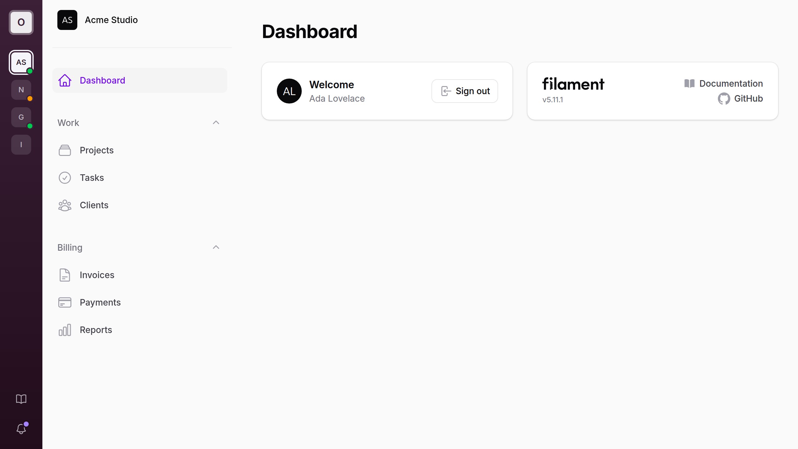
A slim icon rail for Filament panels: your logo, tenant switching and quick links in a dark column beside the sidebar. Taken from the Citrus theme.
What it does
Adds a slim, dark icon rail beside your Filament panel's sidebar: your logo at the top, a tile for each of the user's tenants, and quick links and the notifications bell at the bottom. In a multi-tenant panel the rail becomes the home for tenancy: the current tenant is marked, tenants can carry status dots, and the rail can take on each tenant's brand color. On smaller screens it steps aside and Filament's own controls come back.
The rail comes from Citrus, FilaFly's premium Filament theme, and works on its own in any panel, with or without a theme.
Requirements
- PHP 8.2+
- Filament v4 or v5 (tested with 4.16 on Laravel 12 and 5.11 on Laravel 13)
Installation
Install the package with Composer:
composer require filafly/filament-rail
Publish the assets:
php artisan filament:assets
Then register the plugin in your Filament panel provider:
use Filafly\Rail\RailPlugin;

public function panel(Panel $panel): Panel
{
    return $panel
        ->plugin(RailPlugin::make());
}
What the rail shows
From top to bottom:
- A logo tile linking to the panel's home page.
- A tile for each of the user's tenants, followed by a tile to register a new tenant when the panel allows it.
- Links pinned to the bottom: the tenant menu's links (such as the tenant profile and billing), your own items, and the database notifications bell.
Every icon has a tooltip. The rail sits on a dark surface in both light and dark mode, tinted with the panel's primary color.
Tenancy
With tenancy enabled on the panel, the rail lists every tenant returned by your user's getTenants(). Each tile shows the tenant's avatar when the model implements HasAvatar, and its initials otherwise. Clicking a tile switches to that tenant.
On desktop, the sidebar's tenant menu is hidden, since the rail covers it.
tenantStatus(?Closure $callback)
Adds a status dot to each tenant tile. The closure receives the tenant as $tenant and returns a panel color name, or null for no dot.
RailPlugin::make()
    ->tenantStatus(fn (Team $tenant): ?string => match ($tenant->status) {
        'active' => 'success',
        'paused' => 'warning',
        default => null,
    })
color(string | Closure | null $color)
Tints the whole rail with any CSS color. The closure receives the current tenant as $tenant, so each tenant can carry its own brand. Return null to keep the default.
RailPlugin::make()
    ->color(fn (?Team $tenant): ?string => $tenant?->brand_color)
tenantMenuInSidebar(bool $condition = true)
Keeps Filament's tenant menu in the sidebar on desktop as well.
tenants(bool $condition = true)
Pass false to leave tenants out of the rail entirely. The sidebar's tenant menu then stays where Filament puts it.
Tenant menu links
Filament's tenant menu items that link somewhere appear in the rail: the registration link becomes a tile after the tenants, and the rest (the tenant profile, billing, and your own tenant menu items) join the links at the bottom. They follow Filament's visibility rules, so a user who cannot edit the tenant profile does not see its link.
Tenant menu items that run an action instead of linking somewhere are not shown in the rail.
Brand
logo(string | Closure | null $url)
The image in the rail's logo tile. Defaults to the panel's favicon, then to the first letter of the brand name.
RailPlugin::make()
    ->logo(asset('images/logo-mark.svg'))
sidebarBrand(bool $condition = true)
With the rail carrying the app's identity, the panel's own logo beside it can be redundant. Pass false to hide it on desktop. The sidebar header keeps its collapse button, and the topbar's logo is hidden too when the panel has a topbar.
RailPlugin::make()
    ->sidebarBrand(false)
sidebarTenant(bool $condition = true)
Shows the current tenant's avatar and name in the brand's place on desktop, linking to the tenant's home page. The brand is hidden there while it does. A tenant implementing HasCurrentTenantLabel shows its label above the name, as in Filament's tenant menu.
RailPlugin::make()
    ->sidebarTenant()
On smaller screens, where the rail is hidden, the panel's brand always shows.
Links
items(array | Closure $items)
Pins navigation items to the bottom of the rail. They take an icon, an active icon, isActiveWhen(), visible(), and URLs that open in a new tab. An item with a badge shows a dot.
use Filament\Navigation\NavigationItem;
use Filament\Support\Icons\Heroicon;

RailPlugin::make()
    ->items(fn (): array => [
        NavigationItem::make('Settings')
            ->icon(Heroicon::OutlinedCog6Tooth)
            ->url(fn (): string => Settings::getUrl())
            ->isActiveWhen(fn (): bool => request()->routeIs('filament.admin.pages.settings')),
        NavigationItem::make('Documentation')
            ->icon(Heroicon::OutlinedBookOpen)
            ->url('https://example.com/docs', shouldOpenInNewTab: true),
    ])
Pass a closure when an item's URL depends on the current tenant or request.
Notifications
When the panel has databaseNotifications(), the rail shows a bell that opens Filament's notifications panel, with a dot when there are unread notifications. Filament's own bell, in the sidebar or the topbar, is hidden on desktop.
The dot reflects the unread count when the page loads.
notifications(bool $condition = true)
Pass false to leave the bell out of the rail.
Smaller screens
The rail shows from Filament's lg breakpoint (64rem) up. Below that the sidebar is a drawer, and it keeps Filament's own controls: the tenant menu and the notifications bell come back, and the rail's items() are repeated at the bottom of the sidebar navigation.
Theming
The rail reads a few CSS custom properties, which a theme can override:
--fi-rail-width: width of the rail (default68px)--fi-rail-from: top of the rail's gradient (default: primary 950, darkened)--fi-rail-to: bottom of the rail's gradient (default: primary 950, darkened further)--fi-rail-foreground: icons, initials and the active tile (default: near-white)
:root {
    --fi-rail-width: 72px;
}
A rail tinted with color() derives its gradient from the tint instead.
Full Example
use Filafly\Rail\RailPlugin;
use Filament\Navigation\NavigationItem;
use Filament\Support\Icons\Heroicon;

->plugin(
    RailPlugin::make()
        ->logo(asset('images/logo-mark.svg'))
        ->tenantStatus(fn (Team $tenant): ?string => $tenant->status->getColor())
        ->color(fn (?Team $tenant): ?string => $tenant?->brand_color)
        ->sidebarTenant()
        ->items(fn (): array => [
            NavigationItem::make('Documentation')
                ->icon(Heroicon::OutlinedBookOpen)
                ->url('https://example.com/docs', shouldOpenInNewTab: true),
        ])
)
Source and credits
- Source code, full options and issues: filafly/filament-rail on GitHub
- Taken from the Citrus theme
Free and open source under the MIT license.
Have questions about Rail? Get help in our Discord community.
FilaFly also makes premium themes for Filament panels: Lucent, Prizm, Cypher and Citrus. Browse the themes.